Takeshi Obata and the Art of Death Note
Takeshi Obata is the artist behind manga series such as Hikaru no Go, Death Note and Bakuman. He is one of my favourite artists for his technical ability and stylistic decisions which I wanted to discuss here! I will be focusing on his art in Death Note, since the more realistic style he used in this series appeals to me most (and it is the one I am most familiar with) :3
General Overview
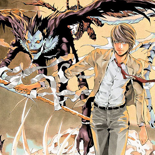
I love Obata's overall style and the face proportions he draws. His style is incredibly clean and precise, with decisive linework and shadow placement. His use of tone and contrast helps elevate the drama of crucial moments as well. The fashion seen in the Death Note series is super cool as too - the clothing choices of each character convey a lot about their personality, such as L's simple white top and jeans or Misa's elaborate, goth outfits.
Linework
Obata's linework is masterful! He uses line weight to convey both the form of the shape and the lighting direction, with thin lines or no line at all being used where light hits the character, or shadows are very subtle.
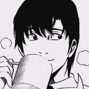
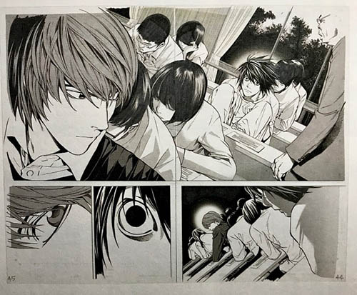
This panel of Matsuda above illustrates this concept well. The line around the rim of the mug is completely omitted where the light hits most strongly. We also see this along the knuckles of Matuda's fingers. The inverse of this is seen along his jawline, where the line thickens seamlessly into a dark shadow shape along the neck. This is a super efficient way to create a sense of light in an illustration using only linework and minimal hatching (it's probably very time efficient too!)
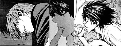
I think over time, he has developed a shorthand to apply this super quickly! An example of this can be seen clearly on many of the side profiles he draws. The bottom of the nose and chin will have a heavier lineweight then the nose bridge and top of the chin. It's subtle but gives drawings a sense of dimension!
An aspect of Obata's style I find really distinctive is how he places a lot of emphasis on occlusion shadows (crevasses where light cannot bounce - the darkest part of the shadow! An example would be the crease of someone's mouth, or the dark shadow where a bowl makes contact with the bench below). In the image above, we see this everywhere - little dark triangles of shadow in between strands of overlapping hair, the hair falling over the face, the corners of the mouth, in the folds of the shirt collar and so on. It's a fast way to create a sense of dimension and overlap in the forms, and combined with the minimal use of shading elsewhere (screentones are often used to convey the local value of an object rather than the shadows hitting the object) it creates a super punchy look which I find really appealing!
Use of Contrast
Another aspect of Obata's style I love is his use of contrast and value to create a sense of drama (which is great because Death Note is notoriously dramatic).
Personally, I think Obata's style really shines in high drama moments! The panels above have depicted moments of low drama, and only the most necessary areas are shaded or filled in with black. There is a lot of white space in the backgrounds which creates a more open atmosphere. Part of this is likely a time saving strategy, where less important panels need to be illustrated as fast as possible to keep up with the schedule of weekly serialisation. However, I think Obata's use of tone is best illustrated by the two introductions L makes! Both important moments where more time has been dedicated to the panel, but with different levels of drama. (As a note, drama does not necessarily mean importance or tension (though they often go hand in hand))
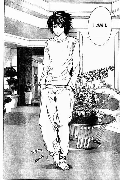
In the panel above, L introduces himself to the task force. It is also the first time the reader sees L in full view. However, I believe this moment is deliberately a low drama moment, because the intention is to subvert reader expectation in a subtly comical way. Prior to this, there was a lot of build up, with L's reveal being left on a cliffhanger. Seeing L standing there with his shabby appearance, slouched posture and the little 'scratch scratch' sound effect is quite humorous after all the suspense. Though the panel is beautifully illustrated, the panel still has a lot of white space and only shadows where strictly necessary. Compare this to L's introduction to Light:
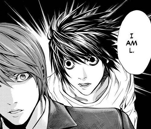
I have included the first encounter and the first introduction, because they both demonstrate this concept well! The composition of the first panel silhouettes L in darkness by framing him against the foliage outside the window. This darkness is often used as a visual shorthand by Obata to assign emotional weight and intensity to particular moments. We see this repeated in the second panel, the reverse shot of Light looking back. By adding a little halo of light around their heads, it draws our focus in a similar way to how the characters have honed in on each other and instantly recognised the other as noteworthy, without exchanging a single word. The drama! Combined with the close ups of their eyes, it creates a wonderfully tense and memorable moment. We see similar concepts employed in the second image. A dark background with more detailed shading and detail to create a sense of drama. The jagged halo in this panel increases the intensity.
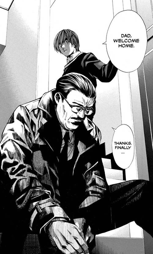
Another great example of this is the reveal that L's father, Soichiro, is the chief of the task force trying to catch Kira, seen above. A very dramatic reveal emphasised by the detailed shading and darkness present in the panel. As an aside, I'd love to discuss the composition in this panel, because I think it contributes heavily to the emotional gut punch of this moment. The placement of the camera situates us near the same level as Soichiro, creating an upwards angle of Light behind him and establishing the power Light has in this moment. Soichiro is hunched over with his back to Light as he takes off his shoes. I also like the decision to obscure his eyes, as it demonstrates a lack of awareness or suspicion. By contrast, Light looks down at Soichiro, with wide focused eyes - by casting a shadow over his face, but not applying it to the eyes, they appear to almost glow and it creates an incredibly eerie feeling. By placing Light directly behind Soichiro, their figures appear to meld together - I love this choice because it shows how interwoven the relationship between these characters are - the bond between them as father and son cannot be undone or severed. All these decisions make Soichiro feel vulnerable - he doesn't know what Light and the reader knows. I think this panel does a masterful job of heightening the drama of this moment and creating a sense of tension for the reader going forwards as we anxiously wait to see if Soichiro will ever discover the truth about his son and how their relationship will change and suffer under Light's decision to become Kira, and Soichiro's unknowing pursuit of him.
Illustration Style
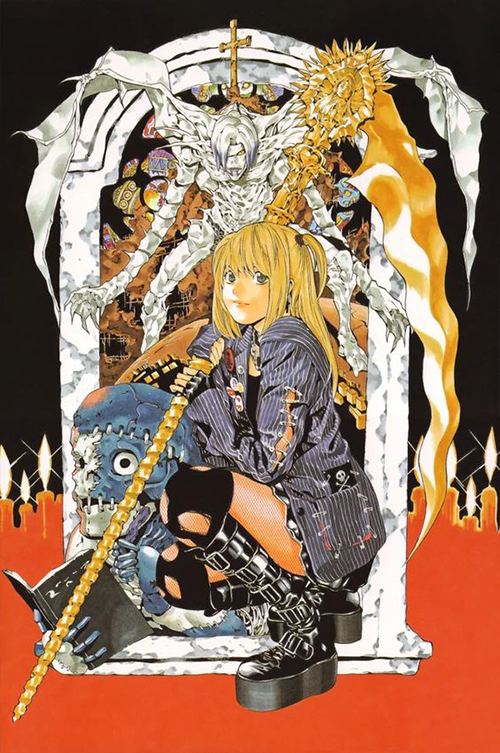
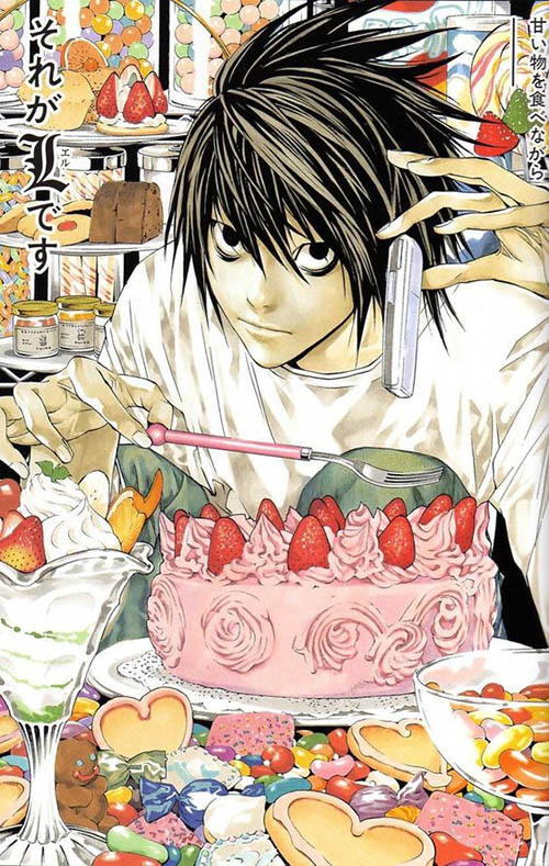
I believe Obata colours his images with alcohol markers. The soft and subtle, often muted shading style look so good contrasted against the clean and precise linework and the spotted black areas. It's super awesome and such a visual treat to look at! And the way he indicates the material and pattern of clothing is so subtle but clear. The subtle grainy texture of L's jeans, or the fishnet pattern of Misa's stockings are great.
Additional Resources (External Links)
- Takeshi Obata Creating an Illustration for Death Note (youtube)
- Takeshi Obata Drawing a Manga Page from Bakuman (youtube)
- Page with a compilation of many of his illustrations across multiple series
- Another Art Analysis on Obata's work! Talks more about his full body of work and some ways to apply certain decisions to your own work (youtube)